
In her discussion of color and texture in floral arrangements, Wilson goes on to discuss these elements in relation to the choice of container. Here she is not discussing church flowers as such, so the church flower arranger must bear in mind that some containers are inappropriate for altar flowers or other church flower arrangements. Also, your church may limit the use of containers to those reserved in the sacristy for altar arrangements. Nevertheless, Wilson's discussion is of interest, especially since it invites the arranger to be sensitive to the interaction of elements. I thought her description of how textiles can affect one's perception was particularly interesting. While altar flowers must never be placed directly on the altar (mensa), they are nevertheless in close proximity to the altar frontal and priest's vestments, so the relation of those textiles on the overall visual effect of the church flowers must be considered.
Here is what Wilson has to say about containers:
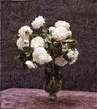
"The container may be a contrast or a repetition of the floral textures. Proper selection of container is something every arranger must learn for herself. Once we all struggled under the stupid rule that roses must be used only in silver or fine crystal. The reason behind this was probably related to a supposed need for similar qualities of textures. Such rules are too inflexible; there are many kinds of roses both elegant and rugged. Some species roses never look well in crystal; pottery is right for them. . . .We must learn to appreciate distinctions in quality. These alone give a sound perspective for successful combinations."Compatibility of textures has nothing to do with cost or rarity. Maidenhair fern, ethereal in substance, grows happily along wooded roadsides with coarser weeds. Its constant companion is Christmas fern, strong and sturdy; yet each complements, not imitates, the other."Maidenhair fern looks well in fragile glass suited to its apparent weightlessness. Gardenias and metals seem not remotely akin, yet fine pewter reflects their textural smoothness. Rose of Sharon grows with democratic unconcern for its neighbors, yet its blossoms rival the quality of old Chinese porcelain."When lecturing, I show textiles with flower arrangements. The audience instinctively rejects combinations which are not good. Often I ask them to analyze the color relationship of flowers, containers, and fabrics. The choice of material seems agreeable enough yet the composition lacks harmony. I substitute another textile of similar hue but of more compatible texture, and the applause is spontaneous. This proves that often what we misjudge as a color fault is an inconsistency in textures. The fact that pigments are surface colors should make us aware of the influence of texture upon color perception."
Source
of text: Adelaide B. Wilson, Color in Flower Arrangements, M.
Barrows and Company, Inc. (New York, 1954), pp. 101-102.
Image: Maidenhair fern from a 1900 botany text, Wikimedia Commons, no known copyright restriction.


No comments:
Post a Comment