
Adelaide B. Wilson has a way of making the art of flower arranging accessible to those of us who have not had the benefit of formal training. That information, in turn, helps in becoming more courageous about attempting a formal floral arrangement for the church or home rather than simply placing some nice flowers in a vase and letting it go at that.
According to Wilson, there are six principles underlying good floral design. They are: proportion, scale, balance, rhythm, contrast, and dominance. What follows is a summary of what I learned from reading Wilson's discussion:
Proportion is good when the arrangement is neither too large nor too small for the space in which it is placed.
Scale has to do with the relation of the size of various parts of the arrangement to the whole. Wilson uses the example of an oak tree, which has a strong trunk and large branches from which grow twigs and, in turn, from the twigs sprout leaves. This gradation is pleasing to the eye.
Balance is good when the arrangement appears stable and secure because it has a good base. Balance is particularly important with church flowers because if the arrangement appears unstable, it will be a distraction during the church service the same way, for instance, that a tilting candle is a distraction.
A stable arrangement can be accomplished by either symmetrical or asymmetrical balance. Formal symmetrical balance is where one side of the arrangement matches the other. That is, the same form and size is used on each side so that there is equal weight on each side. This type of balance is used when a pair of vases is employed.
Asymmetrical balance is achieved by using larger forms on one side and smaller ones on the other in such a way that they have the same visual weight.
Rhythm has to do with how the eye travels through the arrangement. It is achieved by repetition, by creating curving lines in the design, or through the use of color.
Dominance involves making a focal point by means of a bright dominant color, or a group of massed flowers, or a single large bloom.
Contrast relates to the use of foliage and buds or smaller flowers above or away from the dominant focal point such that the eye is drawn upward and outward from the focal point, then permitted to return to the point of importance. That point is usually (but does not have to be) at the rim of the vase -- or to some object to which the design has drawn the eye.
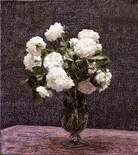
While Monet's "Still Life with Anenomes" (above) is not a flower arrangement as such, it shows very well how rhythm is created with repetition and the use of color. Notice how the green foliage between the blossoms gives rest to the eye as the eye moves from bloom to bloom.
Source:
Based on Wilson, Adelaide B.; Flower Arrangement for Churches (M. Barrows & Co., Inc.; New York, 1952), pp. 56-59.
Image:
Monet's "Still Life with Anemones" (1885), from Wikimedia Commons. In the public domain.


No comments:
Post a Comment