"Since color is a sensation produced by light rays striking an object, it follows that the character of a surface will affect the ultimate color we see. Glossy, hard finishes throw back the light and produce the bright patches we call high lights. A rough surface with its tiny hills and valleys of uneven penetration grays all colors. . . ."In the plant kingdom, there is a vast range of textures. The smooth silk of the tuberous begonia blossom differs from the crinkled silk of a petunia. The organdy-like crispness of carnations is not the same as the shaggy wool of some chrysanthemums. The depth of texture in dahlias is due to the curving of each petal as it is caught at the calyx; their velvet look is produced by shadows on the diminishing depth. Actually the fastened end of a petal may be lighter although it appears darker in the mass. Thus texture influences color perception. . . ."Relationship of textures is important in color harmonies. Contract of textures is only interesting when the elements balance. Nature uses textural opposites in many ways. The rough, prickly stem and coarse leaves of a thistle are in contrast to the delicate flower filaments. However, a mass of these filaments combined in the large flower head provides adequate balance of textures. This contradiction of coarse and fine, well integrated, in a single plant, makes thistles one of our most dramatic wildings, despite their usurpation of pastureland."Other specimens maintain a similarity; tulip smooth and sleek throughout; ageratum wooly and rough. Queen Anne's lace is aptly named, with leaves and blooms equally lacy. Because of their broken texture the near-white flowers appear shadowy gray."
Wednesday, May 29, 2019
Relation of Color & Texture in Flower Arrangements
Adelaide B. Wilson makes some
interesting points about the relationship of color and texture that
can be useful in church flower arrangements. Her descriptions lead
one to look carefully at the elements of a floral design:
Source of text: Color in a Flower
Arrangement, Adelaide B. Wilson, M. Barrows and Company, Inc., New
York (1954),
pp. 100-101.
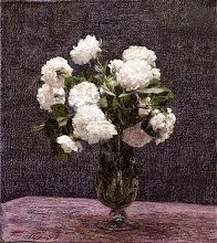
Image: Charles Rennie Mackintosh, Petunias, 1916. From Wikipedia. In the public domain.
Subscribe to:
Post Comments (Atom)


1 comment:
The image of petunias above illustrates Wilson's point in the negative. That is, the container the artist chose for the petunias is not a good one for the flowers. It is helpful to analyze why that is so.
Post a Comment